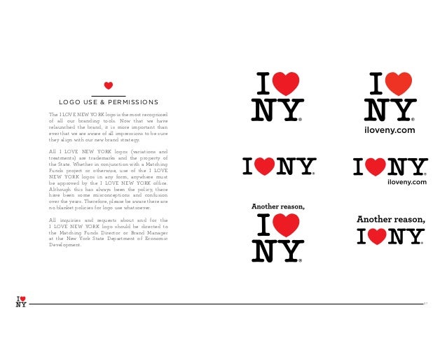
Some ideas that liked from the I Love NY Guideline are the layouts that they provide. Each layout has it's own unique style. For example on the first page, it has the traditional I Heart NY symbol, then underneath, it say Brand Guidelines Including PART 2 for TPAs -November 2008-
They also included a variety of other styles that they use throughout the season.

They layout they provided for what fonts they used for each section. The fonts that are use are, Archer, Gotham and American Typewriter which is my favorite. They also displayed the different weights used for each section of the article. ( Light, Bold, Medium etc.)
They also displayed some flyers that they mad that showed the different areas you can visit when you come to NY.
Comments
Post a Comment